Digital Flyers
Digital Flyers is a local, Black-owned business dedicated to providing essential resources that empower local entrepreneurs, promoters, and event organizers to expand their visibility and operations.
Objective
Digital Flyers engaged us to conduct a user experience review of their website, digitalflyers.com, to gain insights into how end-users, including business owners, promoters, and event planners, interact with the site.
Our team performed a cognitive walkthrough and user research on the website, synthesizing findings with an affinity diagram. Based on this analysis, I restructured the site’s content using a revised information architecture. A prototype plan incorporating scenarios and user stories was developed, and interactive screenflow sketches led to an enhanced prototype of the Digital Flyers website.
Users:
General Public
Business Owners
Event Planners
Promoters
Tools:
diagrams.net
Figma
Google Workspace
otter.ai
Photoshop
Zoom
Process & Methodology:
Cognitive Walkthrough
User Research
Affinity Diagramming Data Synthesis
Information Architecture Diagramming
Team: Tad, Sami, Grace, Haley
Deliverables:
Primary User Research Protocol
Affinity Diagram
Screenflow Sketches
Information Architecture Diagram
Cognitive Walkthrough
To evaluate how well new users navigate the Digital Flyers website, we conducted a cognitive walkthrough (pdf) using client-provided scenarios. For each user task, we addressed these key questions:
Will the user try to achieve the correct outcome?
Is the correct action visible?
Is there a clear connection between the control and the resulting action?
Is sufficient and appropriate feedback provided?
This approach identified several usability challenges, which were documented with recommendations for improvement.
User Research
User research was conducted virtually with one participant, along with analysis of two pre-recorded interviews. Each session ranged from 30 to 60 minutes, using a think-aloud protocol to explore user perceptions and challenges.
Findings indicated that users were primarily concerned with content organization and presentation:
Users felt the homepage was cluttered and overwhelming.
The search functionality was confusing due to numerous filters, some hidden and some visible.
Events were not consistently displayed in chronological order, making it difficult to locate events by date.
Users desired more comprehensive details on event and business pages.
User Quotes:
“I would like to see the events in chronological order.” - User 1
“Too many categories, it looks cluttered” - User 3
“I try to go to them for certain things and I can’t find it” - User 3
“…too many options, hard to locate specific flier or business” - User 2
“I get frustrated with finding events on a particular day.” - User 1
Affinity Diagramming Data Synthesis
The data from user research was synthesized using an affinity diagram, with insights organized into five categories: user sentiment, navigation, information architecture, content, and target audience.
Information Architecture and Screenflow
Guided by the cognitive walkthrough, user research, and data synthesis, we created a new information architecture aimed at improving navigation and user flow. This restructured design was intended to address user concerns and enhance the overall site experience.
Prototype Plan and Interactive Prototype
A prototype plan (pdf) was developed to serve as a blueprint for the interactive prototype. Key recommendations included:
Homepage
Redesign the homepage layout for improved user flow.
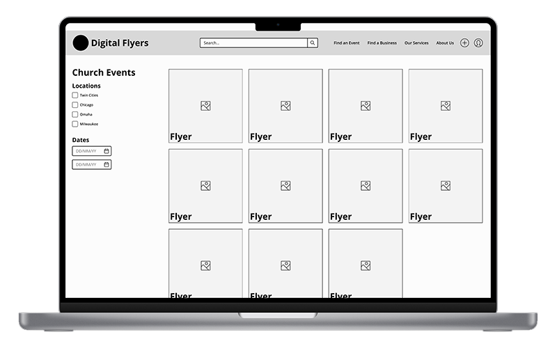
Move event and business filters from the homepage to dropdowns in the main navigation.
Add a “Today’s Events” section.
Introduce a date picker for finding events by specific date.
List all event types chronologically, including recurring events.
Search Functionality
Simplify the search function for ease of use.
Enable filtering by city and date range.
Results Page
Provide dropdown menus for selecting event or business categories.
For events, allow filtering by city and date range.
For businesses, add city-based filters.
Details Page
Reorganize the layout for clearer information flow.
Replace URLs with icons for improved visualization.
Add nearby Digital Flyers restaurants on the event venue map.
Enable business ratings for user feedback.
In Conclusion
Users recognized and valued Digital Flyers’ mission and website content, though the site’s information architecture required improvement for better usability. These recommended changes offer both quick wins and longer-term strategies to enhance user engagement, ensuring a smoother experience and improved understanding of the site’s offerings.


