LiveMore ScreenLess
LiveMore ScreenLess is a local non-profit dedicated to promoting digital wellbeing for young people.
Objective
LiveMore ScreenLess engaged Prime Digital Academy to conduct a usability study on their website, livemorescreenless.org. The organization sought insights into how effectively users could locate meaningful content and how strongly LiveMore ScreenLess was perceived as an authority on digital wellbeing.
To address these goals, our team began with a heuristic analysis and developed a usability testing script featuring targeted tasks, scenarios, and questions. This structured approach enabled us to align our testing with LiveMore ScreenLess’s objectives. The findings from the affinity diagram helped us best understand how to focus our findings and recommendations report.
Users:
Youth
Educators
Families
Individuals
Tools:
Google Workspace
Keynote
otter.ai
Photoshop
Zoom
Process & Methodology:
Heuristic Analysis
Think-Aloud User Testing
Affinity Diagramming Data Synthesis
Deliverables:
Heuristic Analysis
User Testing Script
Team: Saba, Tad, Nicole, Andrew
Heuristic Analysis
The initial heuristic analysis identified areas to focus on for subsequent user testing. Key tasks included:
Locating research conducted by LiveMore ScreenLess on digital wellbeing
Finding the services and solutions offered by the organization
Understanding the process for submitting a blog post
User Testing
We conducted remote user testing with five participants from diverse backgrounds. Each session lasted 30 minutes, during which participants used a think-aloud protocol while attempting the following tasks:
Tasks
Locate a resource on reducing screen time
Find the services and solutions provided by LiveMore ScreenLess
Find and read a blog post about another user’s experience
Attempt to create a blog post
Scenarios
“You recently spent extended time on your phone and are seeking community resources to help reduce screen time. Can you locate supporting evidence on this website?”
“You’re interested in joining the organization’s youth council. Can you walk me through the steps you would take?”
Quantitative Evaluation Participants rated the following on a scale of 1–10:
Clarity of LiveMore ScreenLess’s mission
Perceived expertise of the organization on mental wellbeing
Effectiveness of the website in conveying the organization’s intent
The testing sessions yielded valuable insights into the website’s strengths and areas for improvement.
User Quotes:
“[It] looks like both the founders have a lot of education, degrees and certificates.” - User 1
“I have to jump all over the place to find something I’m looking for.” - User 3
“There's so much information that I don't really know what things I'm supposed to care about.” - User 5
“A lot of this is endless scrolling.” - User 1
“This image here is huge…this picture is kind of overwhelming.” - User 1
“If I were a young person, I don’t think I’d be clicking anything.” - User 2
Affinity Diagramming Data Synthesis
The data from user testing was synthesized using an affinity diagram, organizing key findings into five categories: information hierarchy, navigation, audience alignment, user interface, and user trust. This analysis provided a focused framework for our recommendations.
Findings & Recommendations Report
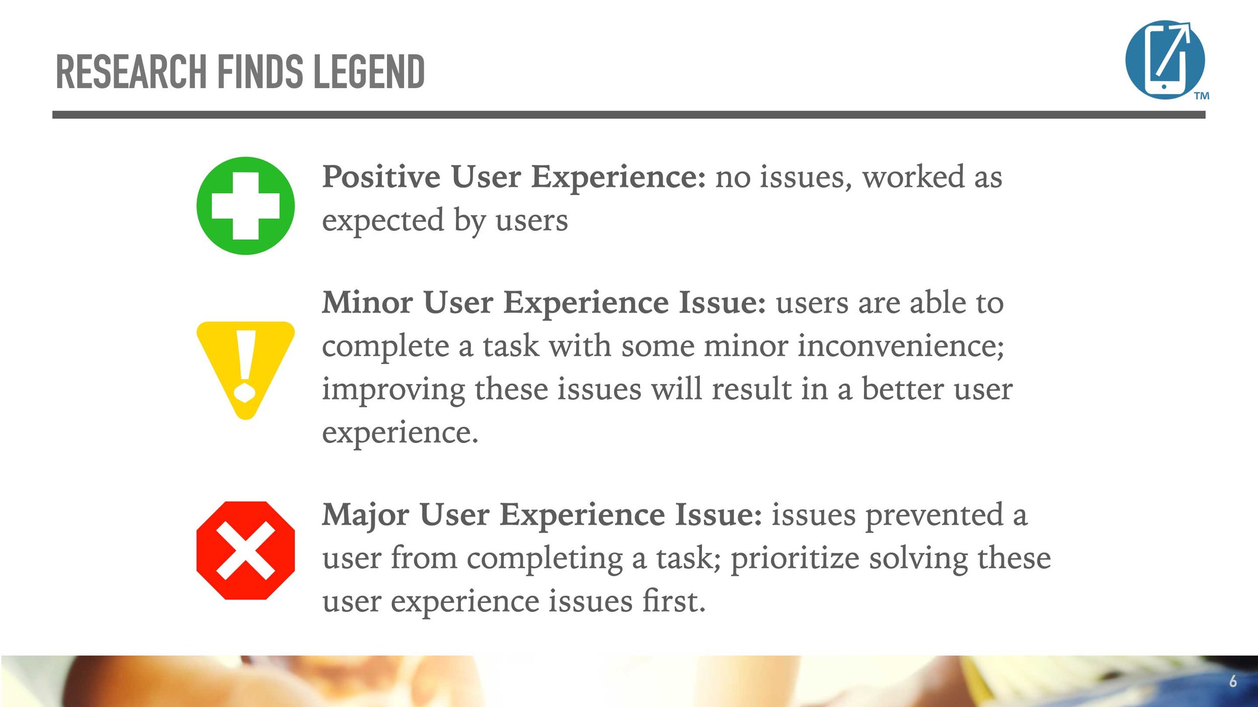
We compiled our findings into a detailed report (pdf), prioritizing issues by severity and providing actionable recommendations. The report summarized critical usability challenges and suggested improvements for each.
In Conclusion
Overall, users found LiveMore ScreenLess to be a credible source of information, thanks to the founders’ credentials. While the website has minor user interface and accessibility issues, the primary challenge lies in content organization. The wealth of information on the site is difficult for users to locate and access. A thorough content audit and reorganization would significantly improve LiveMore ScreenLess’s ability to serve its users effectively.


